Wednesday 9 May 2012

FINAL TRAILER AND ANCILLARY TASKS


My role with regards to the trailer was...I was one of the actresses and I contributed towards the editing along with one other person.


Sunday 29 April 2012

EVALUATION - How did you use media technologies in the construction, research, planning and evaluation stages?


EVALUATION - In what ways does your media product use, develop or challenge forms and conventions of real media products?

Our media product which is a horror trailer does use many typical horror conventions. We felt that using typical conventions was equally as important as breaking them. By breaking them, there is always that element of doubt that it is too changed and the target audience won't like it. The Paranormal Activity films were our biggest inspiration and we ended up using most conventions found in these films. Characters that we used were a young girl with blonde hair and blue eyes. Hitchcock used this character a lot as it connotes a higher level of vulnerability than those with a different hair colour. We also used a dark hooded figure which is our villain. The face of the figure is never revealed during the trailer, so that it builds up more tension and suspense for the audience therefore making it far more scarier for them. Vladimir Propp suggested that each narrative includes many characters. This is a convention which we have broken slightly as we only use three. The victim, the villain and the supporter. By using mainly the girl and figure, it almost adds a personal element as you as the audience feel as though you are the main character and can experience her emotions more and doesn't complicate the narrative for the audience.
Tzvetan Todorov's theory that every narrative can be split into five categories is partially applied to our trailer. He believes that it can be split down into EQUILIBRIUM, DISRUPTION, DISEQUILIBRIUM, SOLUTION and finally NEW EQUILIBRIUM. As we have created a teaser trailer we have not included a solution and we only briefly touched on the new equilibrium right at the end. However we do use equilibrium; where the main character is in the park with friends and also where the main character is having a dream which becomes a nightmare. Then there is disequilibrium; where the hooded figure from the dream appears in reality and the main character spots it on several occasions and finally disruption where the main character tries to out run the demon.
Another extremely typical convention used is the lack of lighting. We filmed several parts outdoors at night and those filmed in other locations feature dark, unnerving lighting which adds to the scary aspect. When editing the trailer together it was essential that we made the trailer appear as if it was a Paramount Pictures Production. With Paranormal Activity being one of their productions, we tried to make the text cards and styling similar, therefore keeping continuity. With Paranormal Activity heavily inspiring us, we feel that their audience would be keen on our film.
As a group we felt that it was important that we didn't use a lyrical song for the soundtrack to accompany the footage on the trailer as this isn't something that happens a lot. We felt that this would add an unprofessional feel to it. We used snippets of musical soundtracks and fitted them together to ensure the sound created as much tension as was possible. This non-diegetic music accompanied some diegetic sounds such as bangs and screams which made it more professional looking. One feature we didn't use was the use of dialogue within the script due to the fact that as a group we felt that our accents would promote the film as being less professional, therefore we used the text cards as a way of conveying messages to the audience. Where dialogue wasn't used, reaction shots to portray the characters emotions.
Our genre is horror and we tried to ensure that we used typical horror conventions and Tom Ryall states that genre provides a framework of structuring rules with regards to patterns/styles etc.. This enabled us to use features that would comply with the horror genre we set out to create.
Steve Neale suggests that the pleasure of popular cinema lies in "difference in repetition." We know that if we conform to too many typical conventions that our audience may not be attracted to the film/trailer. By mixing the use of broken and typical conventions our audience should find it interesting.

Thursday 19 April 2012

EVALUATION - How effective is the combination of your main product and ancillary task?

Our main character, the blonde female does not feature i  my ancillary tasks. I chose to not include her and use the hooded figure instead as I felt this was more enticing. I feel that by having her on the cover and poster alongside the figure it may have revealed too much, whereas just having the figure on it's own leaves the mind to think about why it is there and what it might have to do with the story.
Naomi Wolf, an American feminist states that images of attractive women are used to sell products suggesting that women aspire to be like one another and also there is that extra chance that the product being sold will attract men if there is an attractive woman part of the advertising. Arguably, our main character could fall into this category which would make this theory suitable for our project. We hope that both gender will want to see the film.
Knowing that my main character features heavily in the trailer, this is another reason why I left her out of the ancillary tasks.

Friday 13 April 2012

EVALUATION - What have you learnt from your audience feedback?

In a way, our trailer exploits Uses and Gratifications, a theory set by McQuail, Blumler and Katz. As a group we hope that our target audience will be able to identify with the lifestyle promoted within the trailer. The characters used in the trailer are of a similar age to our target audience which should ultimately allow the audience to have a better connection with the trailer/film. Due to the fact our trailer is a HORROR trailer, our main focus is that the target audience understand and feel the emotions within the storyline, not for the audience to aspire to be like the characters.Evaluation


View more PowerPoint from Olivia Dixon


Friday 16 March 2012

Editing Process

Whilst editing the trailer together, several changes have been made....

- When uploading all the footage onto imovie, as a group we decided to film some extra shots to ensure the narrative made sense.

- Also as a group, we changed the narrative slightly and many parts that we had already filmed got scrapped. We narrowed down our narrative to make it more precise.

- The most significant change made has been the music which accompanies the film. This has changed several times due to many factors
- it wasn't loud enough/it was too loud
- it wasnt fittig with what you could visually see on the screen
- it wasn't fitting with genre too well

After several attempts however we have all reached an outcome which we are happy with

Monday 12 March 2012

Thoughts so far....

At the beginning of our filming experience, our initial storyboard had no annotations on it and as a group we were pretty set on what we wanted to film. However, as filming progressed it was evident that our storyboard only covered the foundations of our trailer and that actually, a lot more would have to be added. Instead of creating another storyboard, we were spontaneous with our filming. We experimented with a lot more camera angles and developed our narrative. When we now compare our footage and our storyboard, there is a huge difference in the two. Our actual footage is far more developed and succesful than if we had strictly stuck to our storyboard. By annotating the storyboard, it helped us massively when filming.

Email To Paramount

Due to the fact that we are wanting to use parts of Paranormal Activity soundtracks, as a group we have to email Paramount ( the production company) to ask for permission.

Filming Process

Tuesday 31st January - Filmed all bedroom scenes, but when looking at them on the computer, the lighting was all wrong.

Wendesday 15th February - Filmed all bedroom scenes for the second time. Had trouble with lighting as we wanted the scenes to be as if they were in the middle of the night. Satisfied with end result however (:

Sunday 26th February - Good filming session! Got all of the scenes that feature in the dream filmed! Very cold outside but was worth it in the end!

Monday 27th February - Due to film but to unexpected rain showers, filming had to be called off. :(

Thursday 1st March - Originally, we were meant to be filming after school only, but after cacelling Monday's session, we also filmed in the morning. All remaining outdoor shots were filmed including some extra filler shots and some inside shots were also filmed.

Sunday 11th March - After looking at all of the shots filmed on the computer and placing them in the order they are due to feature in the trailer some shots were missing. These were filmed today! Succesful and we think we are all done (:

EDITING HERE WE COME! :D

Sunday 19 February 2012

Roles and Responsibilities

To assure that everyone has an equal role within the group, we decided to allocate different jobs and roles between us as this would give everyone a chance to focus on their individual role/roles and have an equal input into what ideas they've come up. Although roles have been split evenly we have decided to work together in the editing process as we think it would be more effective if everyone in the group shared their opinion on what they think looks best and as it’s a vital part of the project.
- Hazel has taken the role of creating the storyboard and is an actress.
- Amy's roles are to focus on the filming and are also in charge of the make-up and costume.
- My roles are being one of the actresses within the horror trailer and I am overseeing most of the editing aspect.
- Natalie is taking charge of filming and props and making sure the trailer continunity throughtout.

Storyboard - Horror Trailer


Tuesday 31 January 2012

Scenario of Plot

P1 has a dream that she is being hunted down by a hooded figure. Throughout the dream there are instances where P1 comes into contact with the figure. She sees herself being killed in the dream and when she wakes up the dream becomes reality. In the rest of the trailer, we see person one in different situations where she and the hooded figure again come into contact with one another.

Monday 7 November 2011

Location Shots - Horror Trailer

These shots that our group have taken show some of the typical locations featured in horror films. We took these photos locally so that if we do choose to use these particular settings, they are easily accessable.


Tuesday 25 October 2011

Ancillary Tasks - Audience Feedback


Final Magazine Cover and Poster


Production Companies

As a group we needed to decide on which company would be producing our film. The choice was between:


Columbia Pictures Industries


Paramount Pictures Corporation


20th Centuary Fox


New Line Cinema


Spyglass Entertainment


Sony Pictures Entertainment


With our group wanting our film/trailer to have a feel of "Paranormal Activity" to it, we decided to use Paramount Pictures as our production company.

Process of Creating Ancillary Tasks

Sunday 23 October 2011

Flat Plans of Ancillary Tasks

Poster

Magazine Cover

These are flat plan designs of how I anticipate my ancillary tasks to look like.

Analysis of Horror Trailers


There are many differences between the two trailers featured above:

Orphan: What makes this trailer particularly effective is the snippets of text that appear every so often throughout the trailer. These pieces of text are phrases picked from the actual movie. The phrases used have been cleverly selected to entice the audience to go see the film. What is also effective is how at the beginning of the trailer, it isn't immediate that it is a horror trailer. As the trailer progresses, the audience then become aware of the genre. This ties in with the plot of the film, as the family don't know their adopted daughter is unsafe. The pace of the trailer is very quite, with very few shots lasting longer than 4 seconds. The girl featured in the trailer is nearly always wearing black; a dark and gloomy colour, which is conventional of a horror trailer.

Paranormal Activity 3: What I like about this trailer is the personal feel. Lots of the shots are handheld to fit in with the theme of a home video. I particularly like the jerkiness between each shot, as it makes the audience feel a little un-nerved. The jerky movements connotate danger and lack of control. Many of the shots this time however are longer than 5 seconds, again fitting in with the filming style. This trailer is fairly simplistic. If it were any more detailed and complex it would lose it's effectiveness. The use of female children in the trailer gives an added sense of vulnerability as opposed to adults featuring.

Character Profiles

Our target audience is aimed at both males and females between the ages of 18 and 25. Character Profiles are an excellent way of invisaging what their interests are.

Becky Robson

Becky, aged 18 is a prospective student who wants to study journalism at University. After University she would like to travel around parts parts of North and South America, documenting her journey as she went. She hopes that this trip could lead to job opportunities elsewhere in the world.
Becky is a fairly outgoing person, and spends most of her free time socialising with friends, whether it be going shopping or going to the cinema, which she enjoys a lot. When she spends time in her apartement she mostly watches television. She enjoys programmes such as CSI and NCIS along with comedy and reality programmes. Due to her living by herself, Becky is a very responsible individual who does weekly food shops at her local supermarket, as she doesn't have a lot of spare money.


Liam Metcalfe

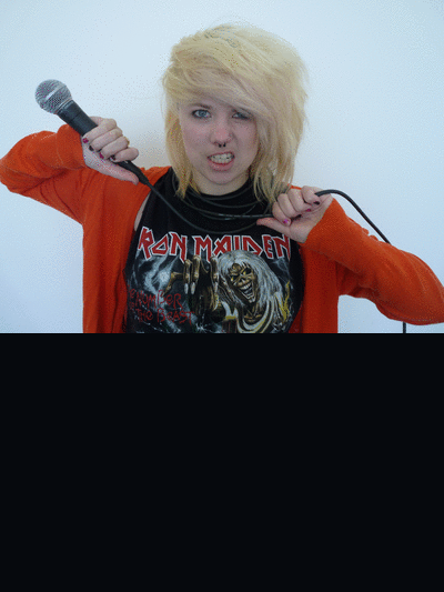
Liam a builder, aged 18 is currently working with a local builders company. Having left school at 16 he has been working there full time to earn a living. However he didn't drop out of school due to poor grades, he just didn't want to carry on with more education. Liam loves listening to music, especially that which fits in to the punk/rock genre with the ocassional dance tune. Liam has a large group of friends that love to go out at weekends to watch football and drink, which he often joins in with. He rarely goes to the cinema, but watches films on his television at home, usually action/adventure of horror films. He much prefers to play on his xbox. He still lives at home with his parents however, so rarely does any household shopping. His parents do a food shop at Marks & Spencers and Waitrose every other week, therefore Liam doesn't have to worry about shopping.

Types of Research and Questionnaire Results

There are two types of research:
- Primary Research - reseach done by me for example questionnaires and interviews. I am making the questions and asking them myself.
- Secondary Reseach - Analysis on articles and trailers. The evidence is already there, I am just analysing it.

To help with our research, our group made questionnaires to give to others our age to find out what they like/dislike about horror trailers, horror posters and horror magazines. Here are the two questionnaires we handed out with a range of outcomes presented in pie charts.

I have chosen to analyse the most significant results that relate specifically to the projects.

Main Task - Horror Trailer

Our group have decided to make a Horror Trailer. As a group we need to discuss and decide on many apsects related to the project.
- scenario of plot
- questionnaires
- analyse professional horror trailers
- roles and responsibilities
- assess horror trailers from previous years
We will need to research what the public like and dislike to give us an insight to what our trailer should include.

A2 - Video Production

This year our aim is to produce a video;
- horror trailer
- music video

along with two ancillary tasks to support your video
- magazine front cover and poster (horror trailer)
- digi pack and advertisement (music video)


To help us develop our skills in producing a video, we took part in a prelimanary task.
Our teacher gave us a basic scenario so we had a starting point for our short film. Our film was to be based on a chase. From that we could decide on the plot.
In our group we had to decide on roles for each of us. My role wad to film. We all contributed ideas on locations in which we could film in and costumes the characters could wear.
During the period of making our film, we learnt how to use digital technology in a more professional manner for example, using the camera in different ways (handheld or on a tripod)
Once all our footage was filmed, we edited it all together on iMovie. We all had input onto how the final outcome would look.
We found making a preliminary project very rewarding.
This our film that we made and a presentation to explain our thought processes.


Sunday 15 May 2011

Final Product!!


All of the photgraphy used in my product is my own. The photos of the model were taken on a set, the photo on the front cover of a festival was taken at the Evolution festival last year and the picture in the bottom right hand corner was taken at The Yeah Yeah Yeah's gig I attended. Finally, the photo of the Paramore album was taken at school.

Thursday 5 May 2011

EVALUATION - (What have you learnt about technologies throughout the proceess? AND Looking back at the preliminary task, what have you learnt?


All of the progress of my work has been uploaded and displayed onto this blog. This means I have become a prosumer (I am both a consumer and producer.) I have created my own technology in the age of WEB 2.0. People who live all over the world will be able to access my blog, therefore making it more popular.

Tuesday 3 May 2011

EVALUATION - (What kind of media institution might distribute your media product?)

With research into BAUER MEDIA GROUP who have now taken over Emap, I found that under their men's entertainment, KERRANG and Q feature, which were magazines included in my style models. This would be the category my magazine would fall into.

I think that BAUER MEDIA GROUP would distribute my magazine. With only two of my style models featured in their list, I feel my magazine would have a relatively good chance at making enough sales. The genre of my magazine is rock and with two of their magazines with an indie genre, and one with a rock, I believe it would fit in well.

EVALUATION - (How does your media product represent particular social groups?)

I deliberately chose to make my artist that features in my article appear to be somewhat a "regular" girl. Especially in the feature article, I chose to show that her rise to fame hasnt made her to confident. This would appeal to the lower and middle working class as they will be able to relate to her.

My model stereotypically represents the genre of rock. She is wearing heavy black makeup and in her pose she is screaming, which isn't very feminine. It is more aggresive, making her appear somewhat masculine. I think that rock magazines fit in with today's post-modern society that we live in. The need to be completely feminine has decreased allowing lee-way for some women to express themselves in a way they feel comfortable.

Although rock is dominated by men, women are pushing the barrier and they are appearing as solo artists and in bands much more.

My main audience for my magazine is obviously men, and by using a female on the front cover, they will find this attractive. However, the secondary audience for my magazine is women, who will look up to and aspire to be like the model.

Sunday 1 May 2011

Thursday 28 April 2011

EVALUATION - (Who would be the audience for your media product? AND How did you attract and address your audience?)

I have targeted my target audience at both males and females bewteen the ages of 14 and 30 as this was was the most common age range that appeared in my initial questionnaire. The majority of people who purchase magazines are of a lower working class, there for my price had to reflect this. When looking at other existing magazines, the prices ranged from £2.50 - £3.99. I placed the price of my magazine at £2.95, hopefully enticing the public to buy it as it is at the cheaper end of the scale. Audience Research enabled me to gain feedback on my product. By collecting the information in different forms, it allows me to recieve varieties of answers. These reponses allow me to edit my product making it better for my audience.In both my interview and the voice recording, before I began recording I simply asked the students to say what they initially thought of my product, then I began recording.


INTERVIEW


VOICE RECORDING


For those who were not included in the audio part of my research, I handed out questionnaires. Some recieved an open questionnaire and some recieved a closed questionnaire. Closed questionnaires allow you to gain specific simple answers, adn open questionnaires allow you to gain more detailed answers.


Here are a selection of the results I collected:


Further down in my blog, I have constructed some character profiles based on who my magazine is aimed for. Here is a link: www.oliviaaadixon.blogspot.com/2011/02/target-audience.html


In 1980, Majorie Ferguson identified 4 different types of facial expressions used on magazine front covers. My magazine is a varient on her theory of "super-smiler." It projects an agressive mood and is demanding. I am also exploiting the theory of uses and gratifications from BLUMLER and KATZ (1974) and I have also exploited Naomi Wolf's (1990) theory of insecurities of women and how erotic images of them are used to sell products to women because we are conditioned by a patriarchal society. The model I have used is of a similar age to my target audience, therefore appealing more.


I also added part of my front cover whilst it was being developed onto facebook so that all of my friends could see it. Facebook has become extrememly popular in recent years and this is a perfect way of gaining audience feedback. Here is a link: http://www.facebook.com/media/set/?set=a.1882093532670.113599.1251276483

Contents Page... so far

Wednesday 16 March 2011

Front Cover... so far


This animated GIF shows some of my photography. I have chosen these as they are the best photos that I took. I will choose some of these to feature in my product. These are the actual photos, in my product, they will be edited up to a better standard.
make a gif
Make a gif

Monday 14 February 2011

Flat Plan Designs

This is how I imagine my front cover, contents page and feature article to roughly look like. On all of my plans, I have stated where text and image will appear. Throughout the process of making my magazine, aspects will differ, therefore these plans are not set in stone.

Front Cover:

I want a medium close up shot of my model for my front page. I believe this type of shot is more engaging for the audience. I plan to have the image overlapping the title of the magazine. This is a trait I picked up on during my research. "Cover lines" or "hooks" will be placed around the main image, just to add a bit more to the page. It isn’t always the main story that sells the magazine. Sub stories also contribute. The headline for the main story is placed at the bottom, which will cover the model's neck. Placing it here will allow the text to be larger and bolder making it stand out more. Typical conventions such as the bar code, website, price and issue will be placed in either the bottom right or left hand corner.

Contents Page:

I have decided on a fairly simple layout. A large column of text is positioned on the left hand side of the pagel, however it will be split up into categories therefore splitting the text up. An image linked to the one on my front page will appear on my contents page at the very top. Several other images will be dotted around the page to advertise several other stories. A letter from the editor is placed in the bottom right hand corner. I do expect my contents page to differ from this plan.


Feature Article:

I want a large image taking up the majority of the left sided page. The title for the article will cover the image partially and the introduction for the article will be positioned underneath the the huge image. On the other page, there will be the main article and several smaller images.


Thursday 10 February 2011

Questionnaire.

My Questionnaire:

It is important to find out what your target audience prefer in a magazine. By giving them a questionnaire, you gain feedback from the person themselves. The imformation is especially important not just to ensure your magazine will sell, but to esnure it will sell to the correct age group. After collecting all of the information together, I can create a magazine that fits all the criteria. When handing out my questionnaire, I will hand it to those between the ages of 14 and 30 like I specified in my Target Audience post.

1) Are you...

Male or Female

2) How old are you?

.........................................................................

3) What attracts you to a particular magazine?

.........................................................................

4) Do you buy music magazines? (If not jump to question 6)

Yes or No

5) If so, what genre of music magazine do you look at/buy the most?

.........................................................................

6) Are there any music magazines which you buy regularly?

.........................................................................

7) If you don’t buy music magazine, why?

.........................................................................

8) How much would you be willing to pay for a music magazine?

£1.50 - £1.99 or £2.00 - £2.49 or £2.50 - £2.99 or £3.00 or above

9) How often do you prefer magazines to be released?

Weekly or Monthly

10) What do you prefer reading in a magazine?

Article or Interview

Target Audience

To be able to create my magazine, it has to be aimed at a specific audience. For the type of magazine I wish to create, my target audience is of both males and females between the ages of 14 and 30. Many factors in the magazine contribute to this such as: content, layout and style.

Character Profile:


- I imagine someone who buys an indie/rock magazine to be a bit individual.

- They're favourite type of music will be of this genre.

- I don't imagine them to like dance/pop/r&b music.

- When thinking of an individual that would buy a rock magazine, I imagine them to have a completely different dress sense than that of someone who buys a pop magazine. I think the way people dress is in some way reflected in what magazines they prefer to read. If they prefer to dress in darker clothing, I think they are more likely to go for a magazine with a darker colour scheme. As many of the bands/artists featured in these magazine are generalised as goths and are typically seen wearing black, my audience would tend to wear dress like their 'idols.'

- However there are those who buy these magazines who don't follow these trends. Also, those who are at the higher end of the age range, will most probably dress completely different and act different to the teenagers. I will have to take this all into consideration.


- These are stereotypical images of people you would imagine to buy this type of magazine.


My Music Magazine

Style Models:

For my music magazine, I have chosen the genre 'indie/rock.' I quite often buy magazines of this type and I feel like I would be able to create a magazine similar to these. I have chosen two magazines as my style models. These magazines are very well known and are stereotypically known for some main features. NME is an indie magazine. Quite often the colour scheme is very bright and garish. I have specifically picked this edition of the magazine because of the minimalistic colour scheme. I particulalry like how the main colours used are black and white, and the accent colour comes from the models hair. This in my opinion is very effective and a clever way to introduce a new colour to the cover. The bold title of the magazine at the top is easy to spot. I like how the main headline and the subheadings can be distinguished from one another due to the font and text size used.


The edition of Kerrang I have chosen is fairly similar to the edition of NME in the way that the colour schemes are very similar. This front cover is busier than the first as there is a lot more image content. I think that both examples are successfull. Some people prefer to look at more on the cover but some find one image enough of a selling point. In order to only use one image, it would need to be a photo of excellent quality.
My Rivals!
My rivals would be Kerrang and NME as these are the most successful magazines in this area.

Wednesday 9 February 2011

What have I learned...

Throughout the process of this preliminary project, I have gained many new skills in photoshop. Some of them taught to me and some through experimentation. I have learned new ways in which to edit lighting and page layout, which are essential in the process of making a front cover and a contents page.
I have learned about the conventions of both front covers and contents pages, and what makes them professional and effective.
I have also developed a sense of good phtography. Previous to the project, when I took photos, I didn't focus on the minor details. Now I know what to look for to ensure I have the best photography possible.